Visualisation
Functions:
|
Create a plot to compare different CP tensors. |
|
Scatterplot of two columns in a factor matrix. |
|
Plot the component vectors of a CP model. |
|
Create a heatmap of the slabs of the optimal core tensor for a given CP tensor and dataset. |
|
Scatter plot with the elements of the optimal core tensor for a given CP tensor. |
|
Create a histogram of model residuals (\(\hat{\mathbf{\mathcal{X}}} - \mathbf{\mathcal{X}}\)). |
|
Diagnostic plots for the optimisation problem. |
|
Create the leverage-residual scatterplot to detect outliers. |
|
Bar chart showing the percentage of variation explained by each of the components. |
|
QQ-plot of the model residuals. |
|
Create scree plot for the given cp tensors. |
- tlviz.visualisation.component_comparison_plot(cp_tensors, row='model', weight_behaviour='normalise', weight_mode=0, plot_kwargs=None)[source]
Create a plot to compare different CP tensors.
This function creates a figure with either D columns and R rows or D columns and N rows, where D is the number of modes, R is the number of components and N is the number of cp tensors to compare.
- Parameters:
- cp_tensorsdict (str -> CPTensor)
Dictionary with model names mapping to decompositions. The model names are used for labels. The components of all CP tensors will be aligned to maximise the factor match score with the components of the first CP tensor in the dictionary (starting with Python 3.7, dictionaries are sorted by insertion order).
- row{“model”, “component”}
- weight_behaviour{“ignore”, “normalise”, “evenly”, “one_mode”} (default=”normalise”)
How to handle the component weights.
"ignore"- Do nothing"normalise"- Normalise all factor matrices"evenly"- All factor matrices have equal norm"one_mode"- The weight is allocated in one mode, all other factor matrices have unit norm columns.
- weight_modeint (optional)
Which mode to have the component weights in (only used if
weight_behaviour="one_mode")- plot_kwargslist of list of dicts
Nested list of dictionaries, one dictionary with keyword arguments for each subplot.
- Returns:
- figmatplotlib figure
- axesarray of matplotlib axes
Examples
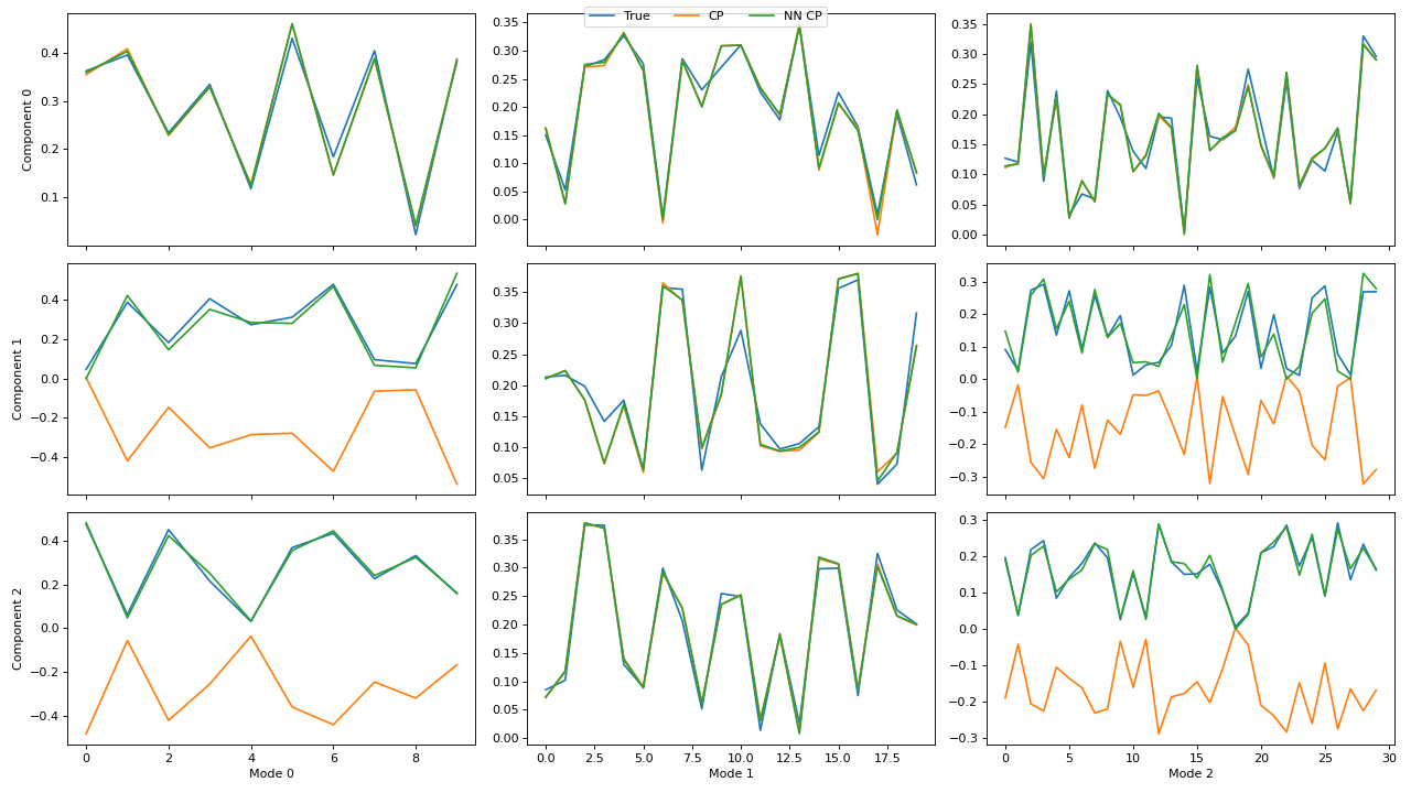
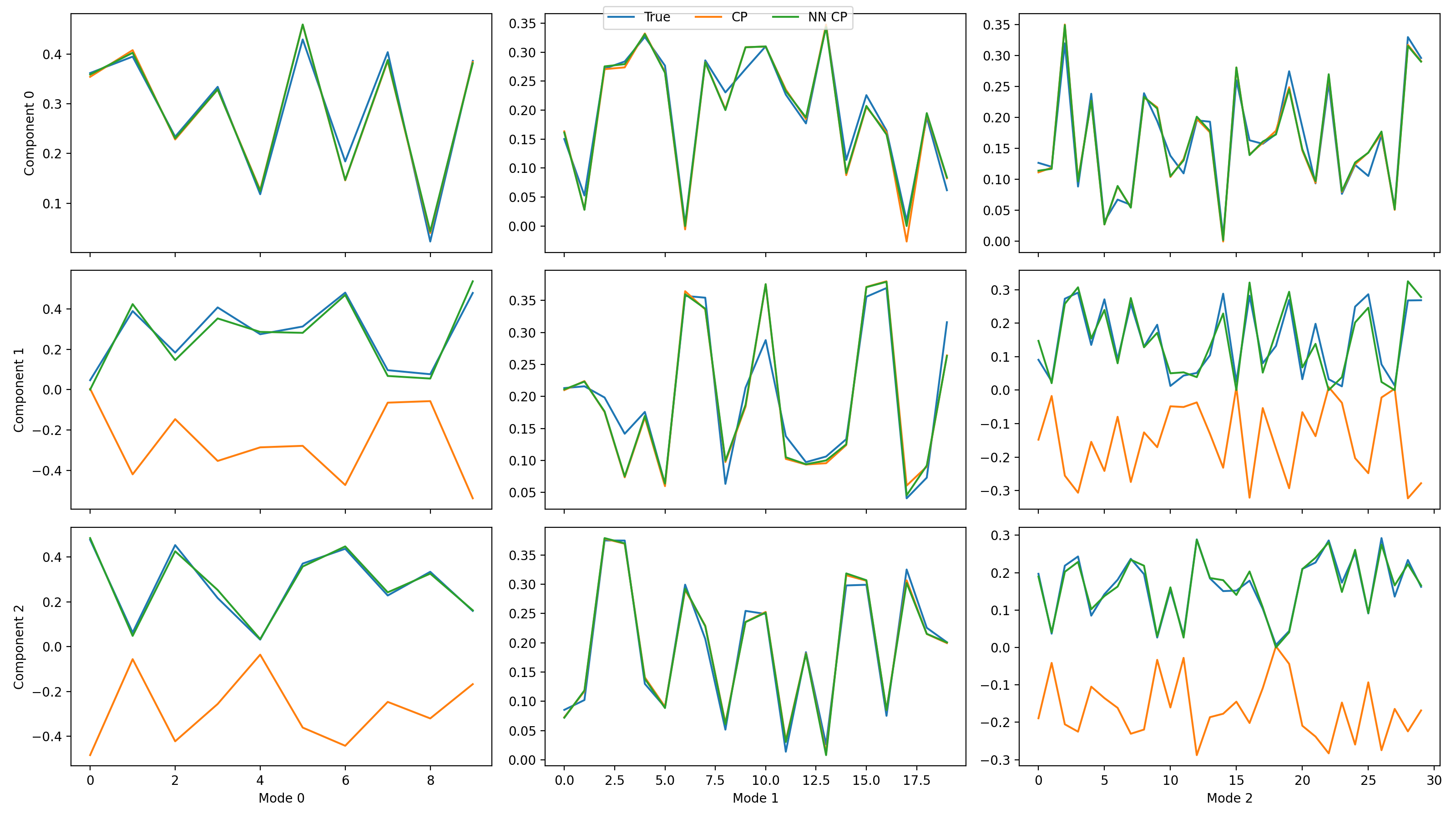
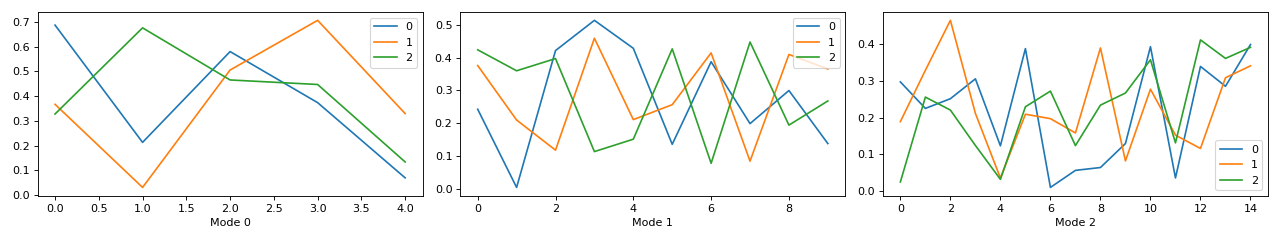
>>> import matplotlib.pyplot as plt
>>> from tensorly.decomposition import parafac, non_negative_parafac_hals
>>> from tlviz.data import simulated_random_cp_tensor
>>> from tlviz.visualisation import component_comparison_plot
>>> from tlviz.postprocessing import postprocess
>>>
>>> true_cp, X = simulated_random_cp_tensor((10, 20, 30), 3, noise_level=0.5, seed=42)
>>> cp_tensors = {
...     "True": true_cp,
...     "CP": parafac(X, 3),
...     "NN CP": non_negative_parafac_hals(X, 3),
... }
>>> fig, axes = component_comparison_plot(cp_tensors, row="component")
>>> plt.show()
(Source code, png, hires.png, pdf)
If not all decompositions have the same number of components, then the components will be aligned with the first (reference) decomposition in the
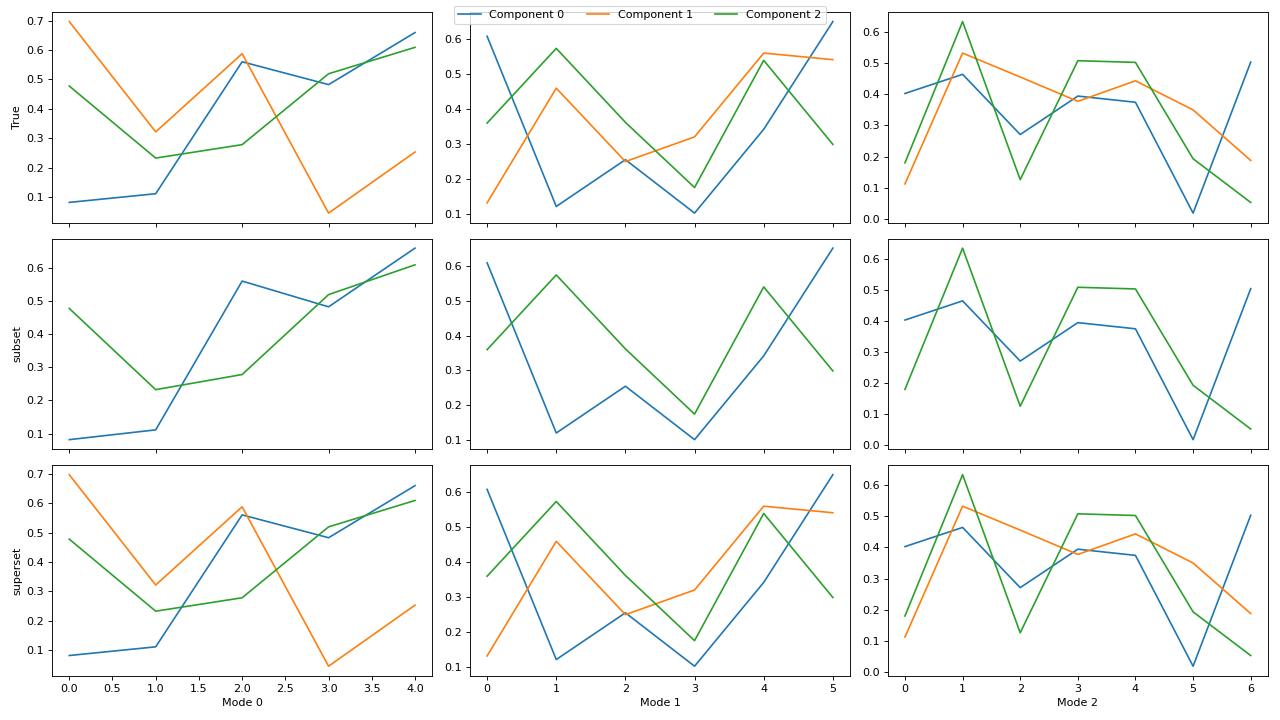
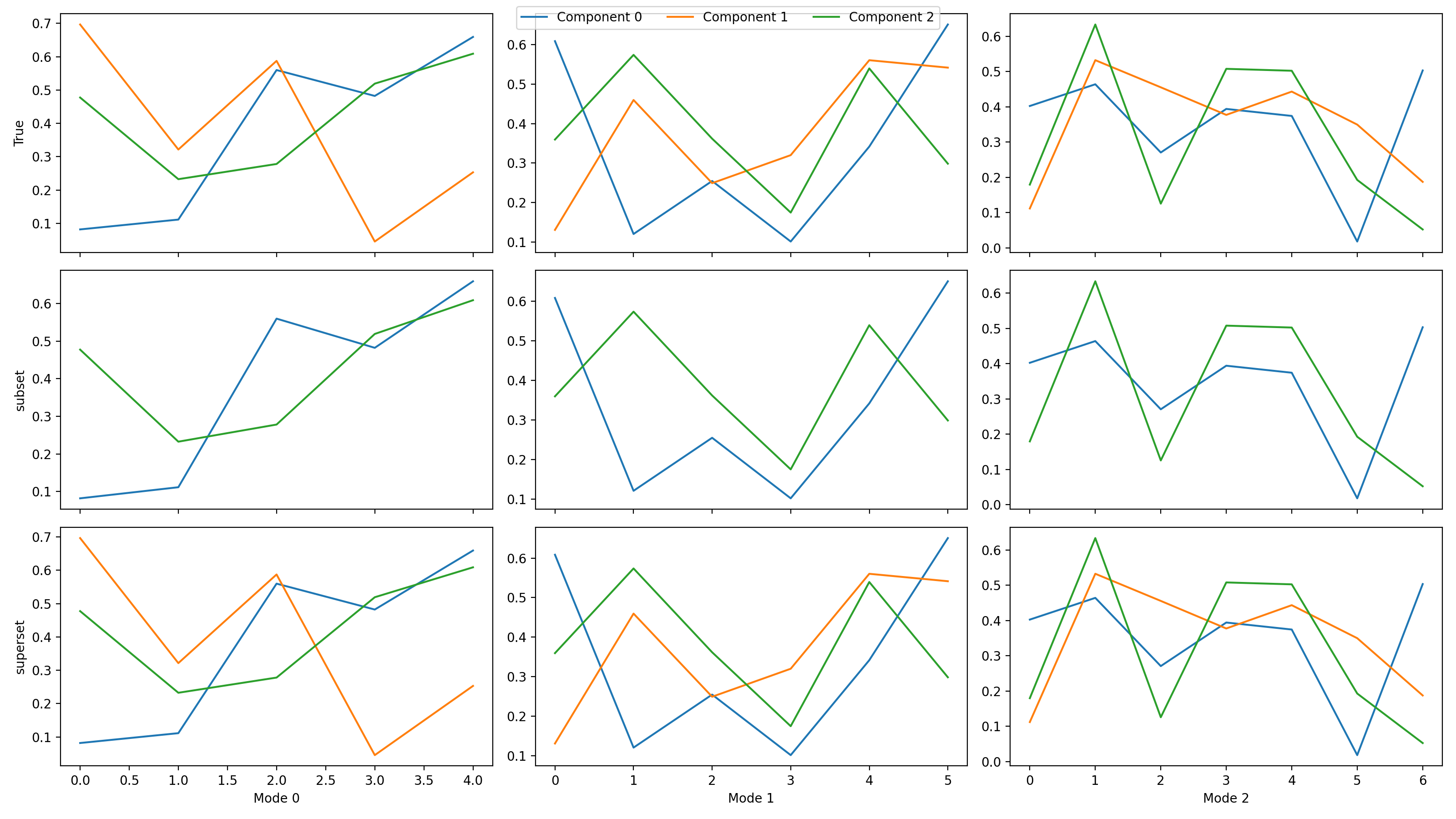
cp_tensors-dictionary. If one of the subsequent decompositions have fewer components than the reference decomposition, then the columns will be aligned correctly, and if one of them has more, then the additional components will be ignored.>>> import matplotlib.pyplot as plt >>> from tlviz.data import simulated_random_cp_tensor >>> from tlviz.factor_tools import permute_cp_tensor >>> from tlviz.postprocessing import postprocess >>> from tlviz.visualisation import component_comparison_plot >>> >>> four_components = simulated_random_cp_tensor((5, 6, 7), 4, noise_level=0.5, seed=42)[0] >>> three_components = permute_cp_tensor(four_components, permutation=[0, 1, 2]) >>> two_components = permute_cp_tensor(four_components, permutation=[0, 2]) >>> # Plot the decomposition >>> cp_tensors = { ... "True": three_components, # Reference decomposition ... "subset": two_components, # Only component 0 and 2 ... "superset": four_components, # All components in reference plus one additional ... } >>> fig, axes = component_comparison_plot(cp_tensors, row="model") >>> plt.show()
(Source code, png, hires.png, pdf)
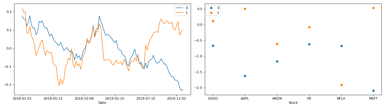
- tlviz.visualisation.component_scatterplot(cp_tensor, mode, x_component=0, y_component=1, ax=None, axis=None, **kwargs)[source]
Scatterplot of two columns in a factor matrix.
Create a scatterplot with the columns of a factor matrix as feature-vectors. Note that since factor matrices are not orthogonal, the distances between points can be misleading. The lack of orthogonality means that distances and angles are “skewed”, and two slabs with vastly different locations in the scatter plot can be very similar (in the case of collinear components). For more information about this phenomenon, see [Kie00] and example 8.3 in [SGB05].
- Parameters:
- cp_tensorCPTensor or tuple
TensorLy-style CPTensor object or tuple with weights as first argument and a tuple of components as second argument
- modeint
Mode for the factor matrix whose columns are plotted
- x_componentint
Component plotted on the x-axis
- y_componentint
Component plotted on the y-axis
- axMatplotlib axes (Optional)
Axes to plot the scatterplot in
- axisint (optional)
Alias for mode. If this is provided, then no value for mode can be provided.
- **kwargs
Additional keyword arguments passed to
ax.scatter.
- Returns:
- axMatplotlib axes
Examples
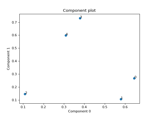
Small example with a simulated third order CP tensor
>>> from tensorly.random import random_cp
>>> from tlviz.visualisation import component_scatterplot
>>> import matplotlib.pyplot as plt
>>> cp_tensor = random_cp(shape=(5,10,15), rank=2)
>>> component_scatterplot(cp_tensor, mode=0)
<AxesSubplot: title={'center': 'Component plot'}, xlabel='Component 0', ylabel='Component 1'>
>>> plt.show()
(Source code, png, hires.png, pdf)
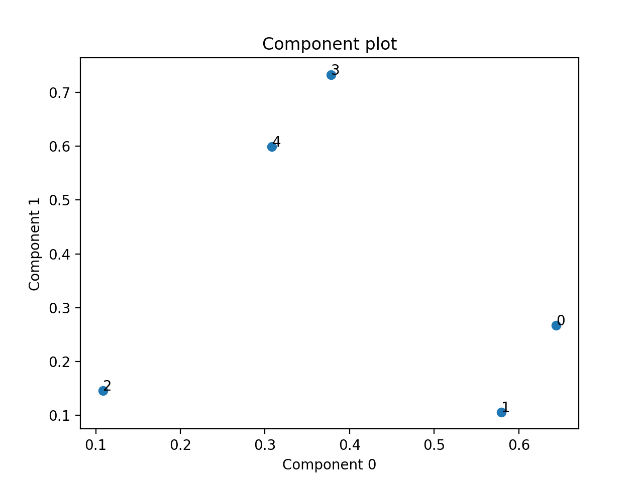
Eexample with PCA of a real stock dataset
>>> import pandas as pd
>>> import numpy as np
>>> import matplotlib.pyplot as plt
>>> import plotly.express as px
>>> from tlviz.postprocessing import label_cp_tensor
>>> from tlviz.visualisation import component_scatterplot
>>>
>>> # Load data and convert to xarray
>>> stocks = px.data.stocks().set_index("date").stack()
>>> stocks.index.names = ["Date", "Stock"]
>>> stocks = stocks.to_xarray()
>>>
>>> # Compute PCA via SVD of centered data
>>> stocks -= stocks.mean(axis=0)
>>> U, s, Vh = np.linalg.svd(stocks, full_matrices=False)
>>>
>>> # Extract two components and convert to cp_tensor
>>> num_components = 2
>>> cp_tensor = s[:num_components], (U[:, :num_components], Vh.T[:, :num_components])
>>> cp_tensor = label_cp_tensor(cp_tensor, stocks)
>>>
>>> # Visualise the components with components_plot
>>> component_scatterplot(cp_tensor, mode=1)
<AxesSubplot: title={'center': 'Component plot'}, xlabel='Component 0', ylabel='Component 1'>
>>> plt.show()
(Source code, png, hires.png, pdf)

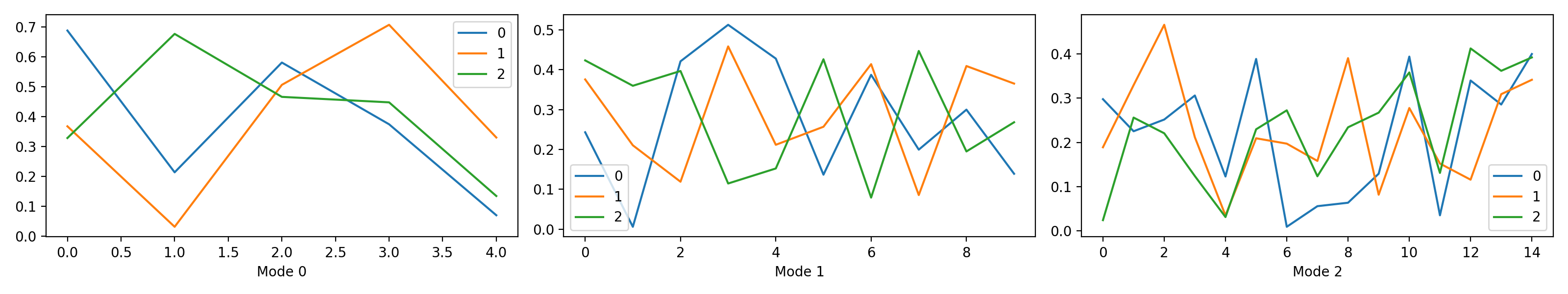
- tlviz.visualisation.components_plot(cp_tensor, weight_behaviour='normalise', weight_mode=0, plot_kwargs=None)[source]
Plot the component vectors of a CP model.
- Parameters:
- cp_tensorCPTensor or tuple
TensorLy-style CPTensor object or tuple with weights as first argument and a tuple of components as second argument
- weight_behaviour{‘ignore’, ‘normalise’, ‘evenly’, ‘one_mode’}
How to handle the component weights.
ignore - Do nothing, just plot the factor matrices
normalise - Plot all components after normalising them
evenly - Distribute the weight evenly across all modes
one_mode - Move all the weight into one factor matrix
- weight_modeint
The mode that the weight should be placed in (only used if
weight_behaviour='one_mode')- plot_kwargslist of dictionaries
List of same length as the number of modes. Each element is a kwargs-dict passed to the plot function for that mode.
- Returns:
- figmatplotlib.figure.Figure
- axesndarray(dtype=matplotlib.axes.Axes)
Examples
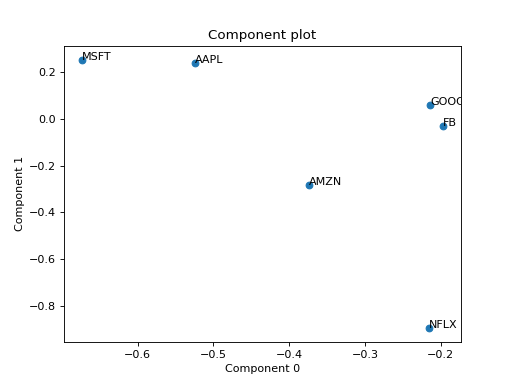
Small example with a simulated CP tensor
>>> from tensorly.random import random_cp
>>> from tlviz.visualisation import components_plot
>>> import matplotlib.pyplot as plt
>>> cp_tensor = random_cp(shape=(5,10,15), rank=3)
>>> fig, axes = components_plot(cp_tensor)
>>> plt.show()
(Source code, png, hires.png, pdf)
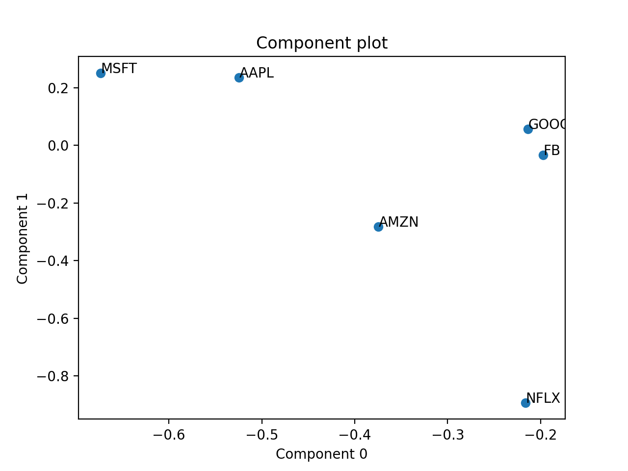
Full example with PCA of a real stock dataset
>>> import pandas as pd
>>> import numpy as np
>>> import matplotlib.pyplot as plt
>>> import plotly.express as px
>>> from tlviz.postprocessing import label_cp_tensor
>>> from tlviz.visualisation import components_plot
>>>
>>> # Load data and convert to xarray
>>> stocks = px.data.stocks().set_index("date").stack()
>>> stocks.index.names = ["Date", "Stock"]
>>> stocks = stocks.to_xarray()
>>>
>>> # Compute PCA via SVD of centered data
>>> stocks -= stocks.mean(axis=0)
>>> U, s, Vh = np.linalg.svd(stocks, full_matrices=False)
>>>
>>> # Extract two components and convert to cp_tensor
>>> num_components = 2
>>> cp_tensor = s[:num_components], (U[:, :num_components], Vh.T[:, :num_components])
>>> cp_tensor = label_cp_tensor(cp_tensor, stocks)
>>>
>>> # Visualise the components with components_plot
>>> fig, axes = components_plot(cp_tensor, weight_behaviour="one_mode", weight_mode=1,
...                             plot_kwargs=[{}, {'marker': 'o', 'linewidth': 0}])
>>> plt.show()
(Source code, png, hires.png, pdf)

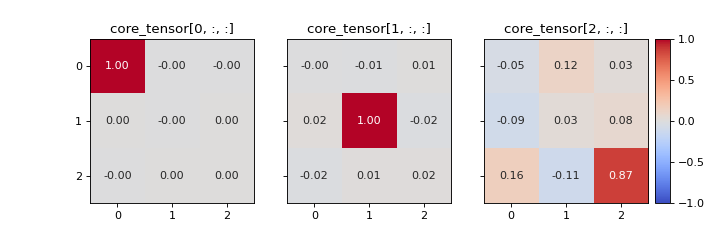
- tlviz.visualisation.core_element_heatmap(cp_tensor, dataset, slice_mode=0, vmax=None, annotate=True, colorbar=True, text_kwargs=None, text_fmt='.2f')[source]
Create a heatmap of the slabs of the optimal core tensor for a given CP tensor and dataset.
It can be useful look at the optimal core tensor for a given CP tensor. This can give valuable information about which components that are modelling multi-linear behaviour and which are not. For example, a component that models noise is more likely to have strong interactions with the other components compared to a component that have a meaningful interpretation. In the core element heatmap, this is shown as rows, columns and/or slabs that have high entries compared to the diagonal.
If the data follows a PARAFAC model perfectly, then there should only be one non-zero entry per slice. For the \(r\)-th slice, the \((r, r)\)-th entry will be 1 and all others will be 0.
Note
The core element heatmap can only be plotted for third-order tensors.
- Parameters:
- cp_tensorCPTensor or tuple
TensorLy-style CPTensor object or tuple with weights as first argument and a tuple of components as second argument
- datasetnp.ndarray or xarray.DataArray
The dataset the CP tensor models.
- slice_mode{0, 1, 2} (default=0)
Which mode to slice the core tensor across.
- vmaxfloat (default=None)
The maximum value for the colormap (a diverging colormap with center at 0 will be used). If
None, then the maximum entry in the core tensor is used.- annotatebool (default=True)
If
True, then the value of the core tensor is plotted too.- text_kwargsdict (default=None)
Additional keyword arguments used for plotting the text. Can for example be used to set the font size.
- text_fmtstr (default=”.2f”)
Formatting string used for annotating.
- Returns:
- figmatplotlib.figure.Figure
- axesndarray(dtype=matplotlib.axes.Axes)
Examples
>>> from tlviz.visualisation import core_element_heatmap
>>> from tlviz.data import simulated_random_cp_tensor
>>> import matplotlib.pyplot as plt
>>> cp_tensor, dataset = simulated_random_cp_tensor((20, 30, 40), 3, seed=0)
>>> fig, axes = core_element_heatmap(cp_tensor, dataset)
>>> plt.show()
(Source code, png, hires.png, pdf)
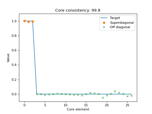
- tlviz.visualisation.core_element_plot(cp_tensor, dataset, normalised=False, ax=None)[source]
Scatter plot with the elements of the optimal core tensor for a given CP tensor.
If the CP-model is appropriate for the data, then the core tensor should be superdiagonal, and all off-superdiagonal entries should be zero. This plot shows the core elements, sorted so the first R scatter-points correspond to the superdiagonal and the subsequent scatter-points correspond to off-diagonal entries in the optimal core tensor.
Together with the scatter plot, there is a line-plot that indicate where the scatter-points should be if the CP-model perfectly describes the data.
- Parameters:
- cp_tensorCPTensor or tuple
TensorLy-style CPTensor object or tuple with weights as first argument and a tuple of components as second argument
- datasetnp.ndarray or xarray.DataArray
The dataset the CP tensor models.
- normalisedbool
If true then the normalised core consistency will be estimated (see
tlviz.model_evaluation.core_consistency)- axMatplotlib axes
Axes to plot the core element plot within
- Returns:
- axMatplotlib axes
Examples
>>> import matplotlib.pyplot as plt
>>> from tensorly.decomposition import parafac
>>> from tlviz.data import simulated_random_cp_tensor
>>> from tlviz.visualisation import core_element_plot
>>> true_cp, X = simulated_random_cp_tensor((10, 20, 30), 3, seed=42)
>>> est_cp = parafac(X, 3)
>>> core_element_plot(est_cp, X)
<AxesSubplot: title={'center': 'Core consistency: 99.8'}, xlabel='Core element', ylabel='Value'>
>>> plt.show()
(Source code, png, hires.png, pdf)
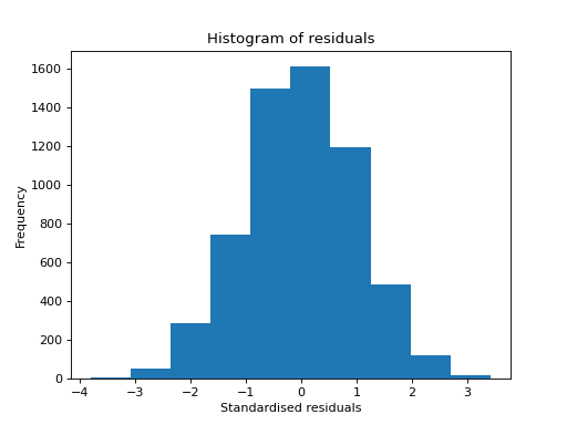
- tlviz.visualisation.histogram_of_residuals(cp_tensor, dataset, ax=None, standardised=True, **kwargs)[source]
Create a histogram of model residuals (\(\hat{\mathbf{\mathcal{X}}} - \mathbf{\mathcal{X}}\)).
- Parameters:
- cp_tensorCPTensor or tuple
TensorLy-style CPTensor object or tuple with weights as first argument and a tuple of components as second argument
- datasetnp.ndarray or xarray.DataArray
Dataset to compare with
- axMatplotlib axes (Optional)
Axes to plot the histogram in
- standardisedbool
If true, then the residuals are divided by their standard deviation
- **kwargs
Additional keyword arguments passed to the histogram function
- Returns:
- axMatplotlib axes
Examples
>>> import matplotlib.pyplot as plt
>>> from tensorly.decomposition import parafac
>>> from tlviz.data import simulated_random_cp_tensor
>>> from tlviz.visualisation import histogram_of_residuals
>>> true_cp, X = simulated_random_cp_tensor((10, 20, 30), 3, seed=0)
>>> est_cp = parafac(X, 3)
>>> histogram_of_residuals(est_cp, X)
<AxesSubplot: title={'center': 'Histogram of residuals'}, xlabel='Standardised residuals', ylabel='Frequency'>
>>> plt.show()
(Source code, png, hires.png, pdf)

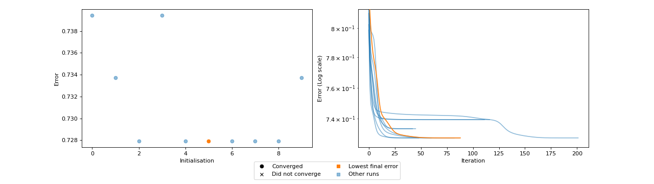
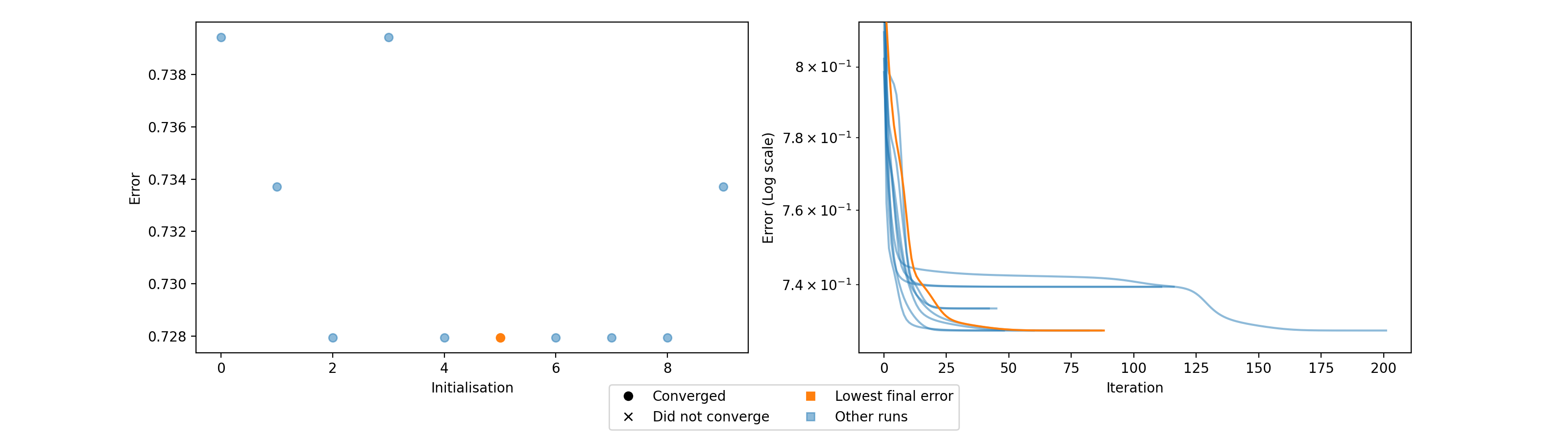
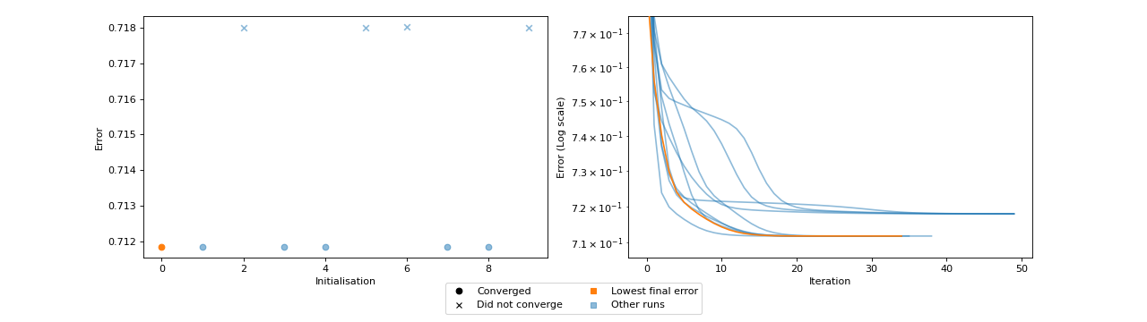
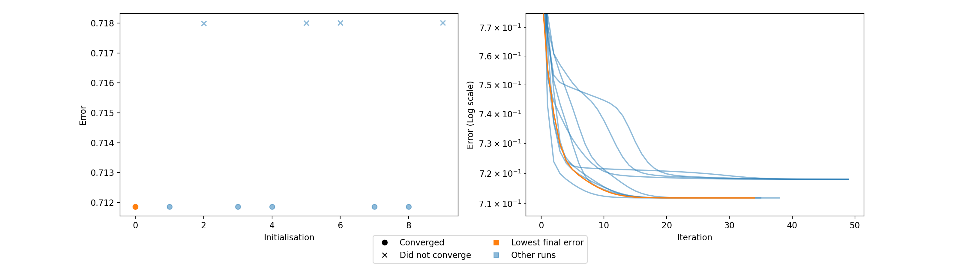
- tlviz.visualisation.optimisation_diagnostic_plots(error_logs, n_iter_max)[source]
Diagnostic plots for the optimisation problem.
This function creates two plots. One plot that shows the loss value for each initialisation and whether or not that initialisation converged or ran until the maximum number of iterations. The other plot shows the error log for each initialisation, with the initialisation with lowest final error in a different colour (orange).
These plots can be helpful for understanding how stable the model is with respect to initialisation. Ideally, we should see that many initialisations converged and obtained the same, low, error. If models converge, but with different errors, then this can indicate that indicates that a stricter convergence tolerance is required, and if no models converge, then more iterations may be required.
- Parameters:
- error_logslist of arrays
List of arrays, each containing the error per iteration for an initialisation.
- n_iter_maxint
Maximum number of iterations for the fitting procedure. Used to determine if the models converged or not.
- Returns:
- figmatplotlib.figure.Figure
- axesarray(dtype=matplotlib.axes.Axes)
Examples
Fit the wrong number of components to show local minima problems
>>> import numpy as np
>>> import matplotlib.pyplot as plt
>>> from tensorly.random import random_cp
>>> from tensorly.decomposition import parafac
>>> from tlviz.visualisation import optimisation_diagnostic_plots
>>>
>>> # Generate random tensor and add noise
>>> rng = np.random.RandomState(1)
>>> cp_tensor = random_cp((5, 6, 7), 2, random_state=rng)
>>> dataset = cp_tensor.to_tensor() + rng.standard_normal((5, 6, 7))
>>>
>>> # Fit 10 models
>>> errs = []
>>> for i in range(10):
...     errs.append(parafac(dataset, 3, n_iter_max=500, return_errors=True, init="random", random_state=rng)[1])
>>>
>>> # Plot the diganostic plots
>>> fig, axes = optimisation_diagnostic_plots(errs, 500)
>>> plt.show()
(Source code, png, hires.png, pdf)
Fit a model with too few iterations
>>> import numpy as np
>>> import matplotlib.pyplot as plt
>>> from tensorly.random import random_cp
>>> from tensorly.decomposition import parafac
>>> from tlviz.visualisation import optimisation_diagnostic_plots
>>>
>>> # Generate random tensor and add noise
>>> rng = np.random.RandomState(1)
>>> cp_tensor = random_cp((5, 6, 7), 3, random_state=rng)
>>> dataset = cp_tensor.to_tensor() + rng.standard_normal((5, 6, 7))
>>>
>>> # Fit 10 models
>>> errs = []
>>> for i in range(10):
...     errs.append(parafac(dataset, 3, n_iter_max=50, return_errors=True, init="random", random_state=rng)[1])
>>>
>>> # Plot the diagnostic plots
>>> fig, axes = optimisation_diagnostic_plots(errs, 50)
>>> plt.show()
(Source code, png, hires.png, pdf)

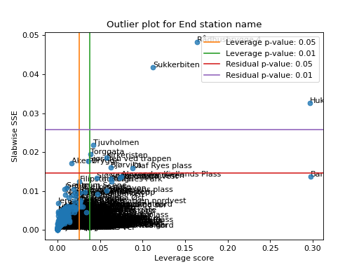
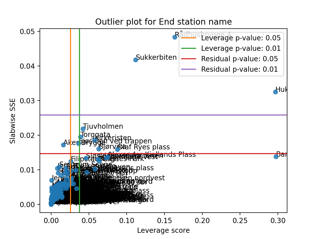
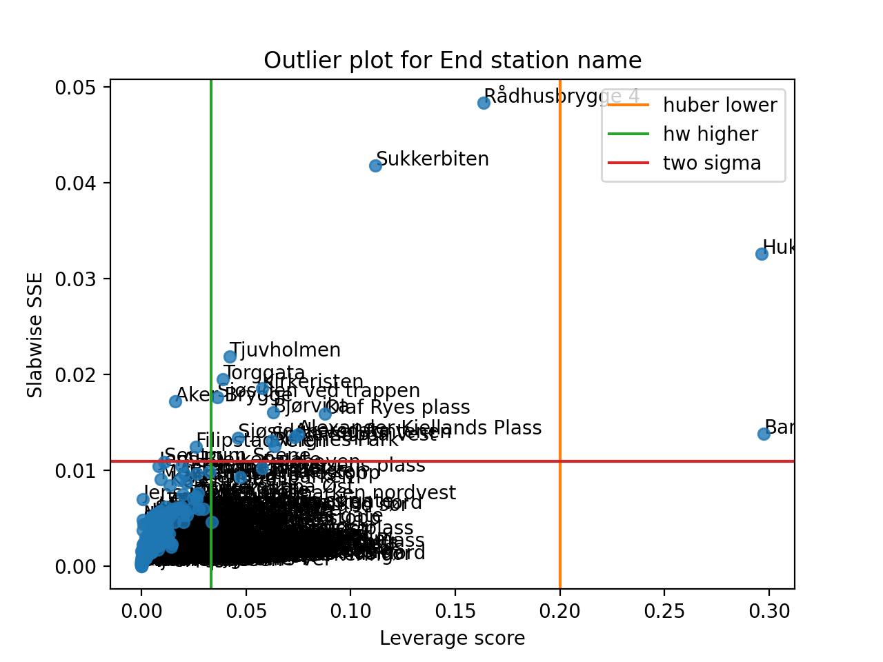
- tlviz.visualisation.outlier_plot(cp_tensor, dataset, mode=0, leverage_rules_of_thumb=None, residual_rules_of_thumb=None, p_value=0.05, ax=None, axis=None)[source]
Create the leverage-residual scatterplot to detect outliers.
Detecting outliers can be a difficult task, and a common way to do this is by making a scatter-plot where the leverage score is plotted against the slabwise SSE (or residual).
- Parameters:
- cp_tensorCPTensor or tuple
TensorLy-style CPTensor object or tuple with weights as first argument and a tuple of components as second argument
- datasetnp.ndarray or xarray.DataArray
Dataset to compare with
- modeint
Which mode (axis) to create the outlier plot for
- leverage_rules_of_thumbstr or iterable of str
Rule of thumb(s) used to create lines for detecting outliers based on leverage score. Must be a supported argument for
methodwithtlviz.outliers.get_leverage_outlier_threshold(). Ifleverage_rules_of_thumbis an iterable of strings, then multiple lines will be drawn, one for each method.- residual_rules_of_thumbstr or iterable of str
Rule of thumb(s) used to create lines for detecting outliers based on residuals. Must be a supported argument for
methodwithtlviz.outliers.get_slabwise_sse_outlier_threshold(). Ifresidual_rules_of_thumbis an iterable of strings, then multiple lines will be drawn, one for each method.- p_valuefloat or iterable of float
p-value(s) to use for both the leverage and residual rules of thumb. If an iterable of floats is used, then there will be drawn lines for each p-value.
- axMatplotlib axes
Axes to plot outlier plot in. If
None, thenplt.gca()is used.- axisint (optional)
Alias for mode. If set, then mode cannot be set.
- Returns:
- axMatplotlib axes
Axes with outlier plot in
See also
Examples
Here is a simple example demonstrating how to use the outlier plot to detect outliers based on the Oslo bike sharing data.
>>> import matplotlib.pyplot as plt
>>> from tensorly.decomposition import non_negative_parafac_hals
>>> from tlviz.data import load_oslo_city_bike
>>> from tlviz.postprocessing import postprocess
>>> from tlviz.visualisation import outlier_plot
>>>
>>> data = load_oslo_city_bike()
>>> X = data.data
>>> cp = non_negative_parafac_hals(X, 3, init="random")
>>> cp = postprocess(cp, dataset=data, )
>>>
>>> outlier_plot(
...     cp, data, leverage_rules_of_thumb='p-value', residual_rules_of_thumb='p-value', p_value=[0.05, 0.01]
... )
<AxesSubplot: title={'center': 'Outlier plot for End station name'}, xlabel='Leverage score', ylabel='Slabwise SSE'>
>>> plt.show()
(Source code, png, hires.png, pdf)
We can also provide multiple types of rules of thumb
>>> import matplotlib.pyplot as plt
>>> from tensorly.decomposition import non_negative_parafac_hals
>>> from tlviz.data import load_oslo_city_bike
>>> from tlviz.postprocessing import postprocess
>>> from tlviz.visualisation import outlier_plot
>>>
>>> data = load_oslo_city_bike()
>>> X = data.data
>>> cp = non_negative_parafac_hals(X, 3, init="random")
>>> cp = postprocess(cp, dataset=data, )
>>>
>>> outlier_plot(
...     cp, data, leverage_rules_of_thumb=['huber lower', 'hw higher'], residual_rules_of_thumb='two sigma'
... )
<AxesSubplot: title={'center': 'Outlier plot for End station name'}, xlabel='Leverage score', ylabel='Slabwise SSE'>
>>> plt.show()
(Source code, png, hires.png, pdf)

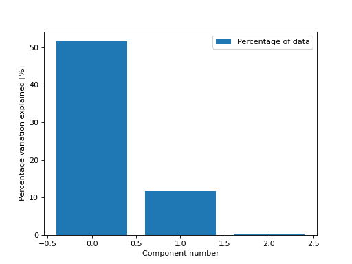
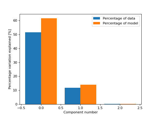
- tlviz.visualisation.percentage_variation_plot(cp_tensor, dataset=None, method='model', ax=None)[source]
Bar chart showing the percentage of variation explained by each of the components.
- Parameters:
- cp_tensorCPTensor or tuple
TensorLy-style CPTensor object or tuple with weights as first argument and a tuple of components as second argument
- datasetnp.ndarray or xarray.DataArray
Dataset to compare with, only needed if
method="data"ormethod="both".- model{“model”, “data”, “both”} (default=”model”)
Whether the percentage variation should be computed based on the model, data or both.
- axmatplotlib axes
Axes to draw the plot in
- Returns:
- matplotlib axes
Axes with the plot in
Examples
By default, we get the percentage of variation in the model each component explains
>>> from tlviz.visualisation import percentage_variation_plot
>>> from tlviz.data import simulated_random_cp_tensor
>>> import matplotlib.pyplot as plt
>>> cp_tensor, dataset = simulated_random_cp_tensor(shape=(5,10,15), rank=3, noise_level=0.5, seed=0)
>>> percentage_variation_plot(cp_tensor)
<AxesSubplot: xlabel='Component number', ylabel='Percentage variation explained [%]'>
>>> plt.show()
(Source code, png, hires.png, pdf)

We can also get the percentage of variation in the data that each component explains
>>> from tlviz.visualisation import percentage_variation_plot
>>> from tlviz.data import simulated_random_cp_tensor
>>> import matplotlib.pyplot as plt
>>> cp_tensor, dataset = simulated_random_cp_tensor(shape=(5,10,15), rank=3, noise_level=0.5, seed=0)
>>> percentage_variation_plot(cp_tensor, dataset, method="data")
<AxesSubplot: xlabel='Component number', ylabel='Percentage variation explained [%]'>
>>> plt.show()
(Source code, png, hires.png, pdf)
Or both the variation in the data and in the model
>>> from tlviz.visualisation import percentage_variation_plot
>>> from tlviz.data import simulated_random_cp_tensor
>>> import matplotlib.pyplot as plt
>>> cp_tensor, dataset = simulated_random_cp_tensor(shape=(5,10,15), rank=3, noise_level=0.5, seed=0)
>>> percentage_variation_plot(cp_tensor, dataset, method="both")
<AxesSubplot: xlabel='Component number', ylabel='Percentage variation explained [%]'>
>>> plt.show()
(Source code, png, hires.png, pdf)

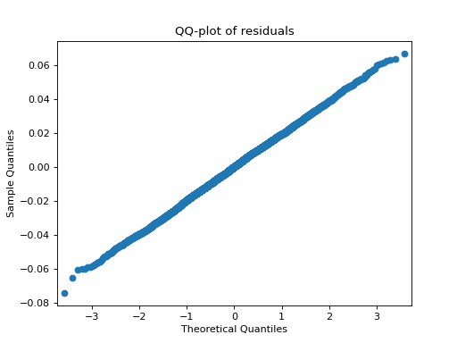
- tlviz.visualisation.residual_qq(cp_tensor, dataset, ax=None, use_pingouin=False, **kwargs)[source]
QQ-plot of the model residuals.
By default,
statsmodelsis used to create the QQ-plot. However, ifuse_pingouin=True, then we import the GPL-3 lisenced Pingouin library to create a more informative QQ-plot.- Parameters:
- cp_tensorCPTensor or tuple
TensorLy-style CPTensor object or tuple with weights as first argument and a tuple of components as second argument
- datasetnp.ndarray or xarray.DataArray
Dataset to compare with
- axMatplotlib axes (Optional)
Axes to plot the qq-plot in
- use_pingouinbool
If true, then the GPL-3 licensed
pingouin-library will be used for generating an enhanced QQ-plot (with error bars), at the cost of changing the license of tlviz into a GPL-license too.- **kwargs
Additional keyword arguments passed to the qq-plot function (
statsmodels.api.qqplotorpingouin.qqplot)
- Returns:
- axMatplotlib axes
Examples
>>> import matplotlib.pyplot as plt
>>> from tensorly.decomposition import parafac
>>> from tlviz.data import simulated_random_cp_tensor
>>> from tlviz.visualisation import residual_qq
>>> true_cp, X = simulated_random_cp_tensor((10, 20, 30), 3, seed=0)
>>> est_cp = parafac(X, 3)
>>> residual_qq(est_cp, X)
<AxesSubplot: title={'center': 'QQ-plot of residuals'}, xlabel='Theoretical Quantiles', ylabel='Sample Quantiles'>
>>> plt.show()
(Source code, png, hires.png, pdf)
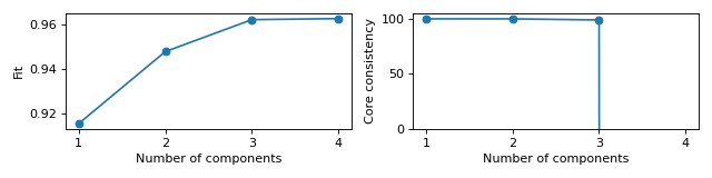
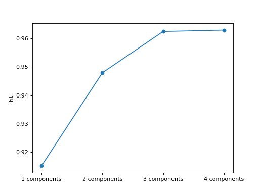
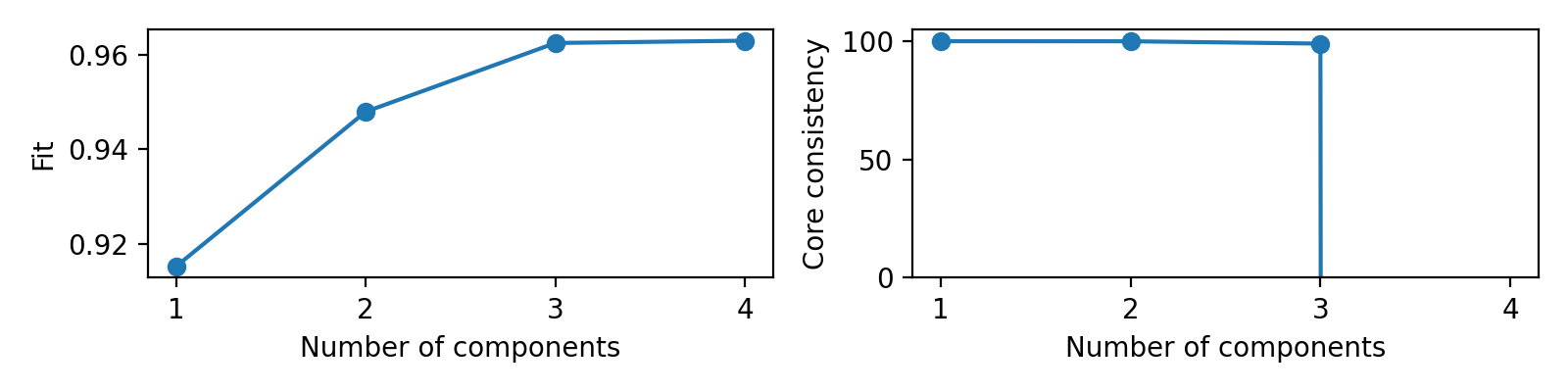
- tlviz.visualisation.scree_plot(cp_tensors, dataset, errors=None, metric='Fit', ax=None)[source]
Create scree plot for the given cp tensors.
A scree plot is a plot with the model on the x-axis and a metric (often fit) on the y-axis. It is commonly plotted as a line plot with a scatter point located at each model.
- Parameters:
- cp_tensor: dict[Any, CPTensor]
Dictionary mapping model names (often just the number of components as an int) to a model.
- dataset: numpy.ndarray or xarray.DataArray
Dataset to compare the model against.
- errors: dict[Any, float] (optional)
The metric to plot. If given, then the cp_tensor and dataset-arguments are ignored. This is useful to save computation time if, for example, the fit is computed beforehand.
- metric: str or Callable
Which metric to plot, should have the signature
metric(cp_tensor, dataset)and return a float. If it is a string, then this will be used as the y-label and metric will be set tometric = getattr(tlviz.model_evaluation, metric). Also, ifmetricis a string, then it is converted to lower-case letters and spaces are converted to underlines before getting the metric from themodel_evaluationmodule.- ax: matplotlib axes
Matplotlib axes that the plot will be placed in. If
None, thenplt.gca()will be used.
- Returns:
- ax
Matplotlib axes object with the scree plot
Examples
Simple scree plot of fit
>>> from tlviz.data import simulated_random_cp_tensor
>>> from tlviz.visualisation import scree_plot
>>> import matplotlib.pyplot as plt
>>> from tensorly.decomposition import parafac
>>>
>>> dataset = simulated_random_cp_tensor((10, 20, 30), rank=3, noise_level=0.2, seed=42)[1]
>>> cp_tensors = {}
>>> for rank in range(1, 5):
...     cp_tensors[f"{rank} components"] = parafac(dataset, rank, random_state=1)
>>>
>>> ax = scree_plot(cp_tensors, dataset)
>>> plt.show()
(Source code, png, hires.png, pdf)

Scree plots for fit and core consistency in the same figure
>>> from tlviz.data import simulated_random_cp_tensor
>>> from tlviz.visualisation import scree_plot
>>> import matplotlib.pyplot as plt
>>> from tensorly.decomposition import parafac
>>>
>>> dataset = simulated_random_cp_tensor((10, 20, 30), rank=3, noise_level=0.2, seed=42)[1]
>>> cp_tensors = {}
>>> for rank in range(1, 5):
...     cp_tensors[rank] = parafac(dataset, rank, random_state=1)
>>>
>>> fig, axes = plt.subplots(1, 2, figsize=(8, 2), tight_layout=True)
>>> ax = scree_plot(cp_tensors, dataset, ax=axes[0])
>>> ax = scree_plot(cp_tensors, dataset, metric="Core consistency", ax=axes[1])
>>> # Names are converted to lowercase and spaces are converted to underlines when fetching metric-function,
>>> # so "Core consistency" becomes getattr(tlviz.model_evaluation, "core_consistency")
>>>
>>> for ax in axes:
...     xlabel = ax.set_xlabel("Number of components")
...     xticks = ax.set_xticks(list(cp_tensors.keys()))
>>> limits = axes[1].set_ylim((0, 105))
>>> plt.show()
(Source code, png, hires.png, pdf)